Design Projects
The following are just a few examples of my creative vision Creating clean clear designs that communicates a brands story .

2023
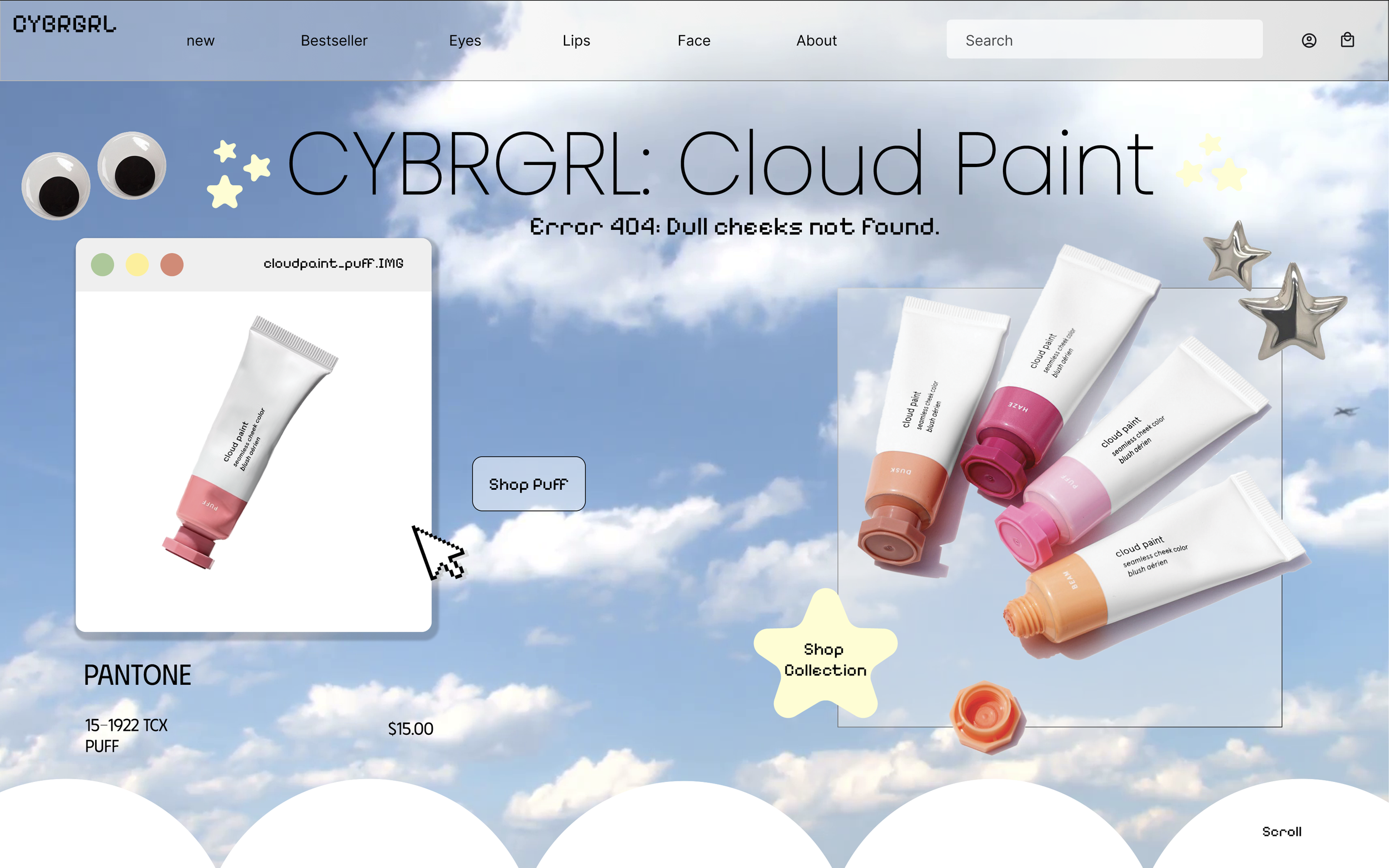
A Personal Project for a mock up makeup brand I created labeled, “CYBRBRL”. For this brand It was important to design for my target audience, I felt that this generation of tweens has a higher interest in beauty products than past generations. I wanted to create a fun cutesy makeup line for the tween-teen ages 12-17. The Y2k nostalgic style has been popular as of recent with teens. I wanted to add the tech/cyber culture and lingo to the brand as well to take this even further. It’s giving cute Y2k cyber girly !
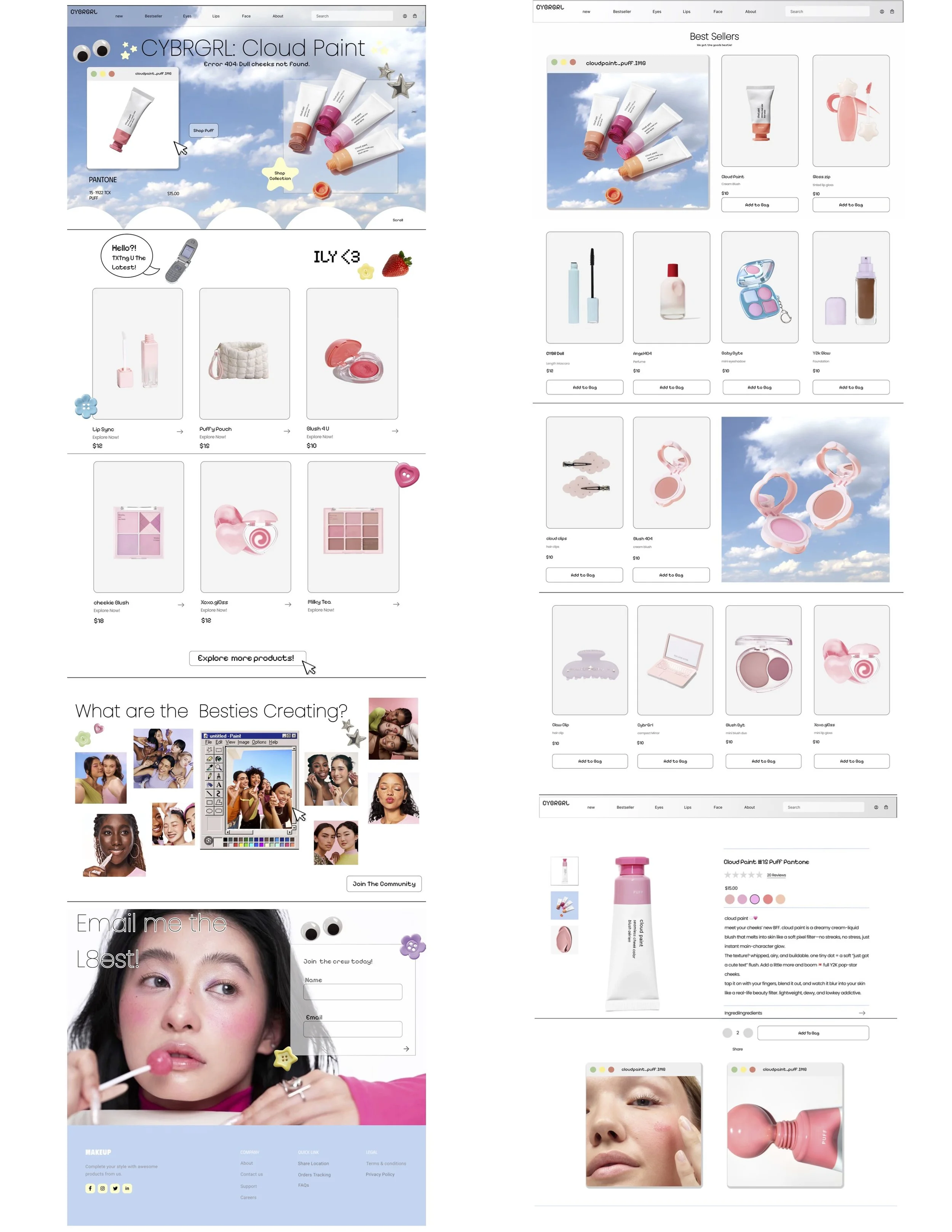
The visual branding blends early-internet UI aesthetics with playful, pastel cosmetics creating a brand that feels cute, interactive, and slightly ironic. My target audience being Gen Z as well as Gen Alpha that is into soft glam, internet culture and nostalgia. The color palette is light and airy with sky blues, baby pinks, and creamy whites and light grays that help with the UI base aesthetic. In choosing these colors my goal was to create a dreamy cloud like softness to the website while still feeling playful and youthful, nothing too luxe so that the brand is more approachable and fun especially for a younger audience. Typography is a mix between a modern sans- serif and a pixel UI font. This creates a fun contrast between a structured minimal e-commerce UI and a chaotic cute personality driven text. I wanted to do this to mirror early internet design like AIM, or desktop interfaces. For the layout I wanted it to be clean and the typical e-commerce setup with intentional "interruptions". The floating windows that resemble desktop image previews or a literal MS paint style interface, and overlapping elements like stickers, buttons, and fruits gives the website a digital scrapbook vibe, not just a store. What makes the branding stand out is the UI concept—the “fake desktop / pop-up window” approach gives it a strong, ownable identity.
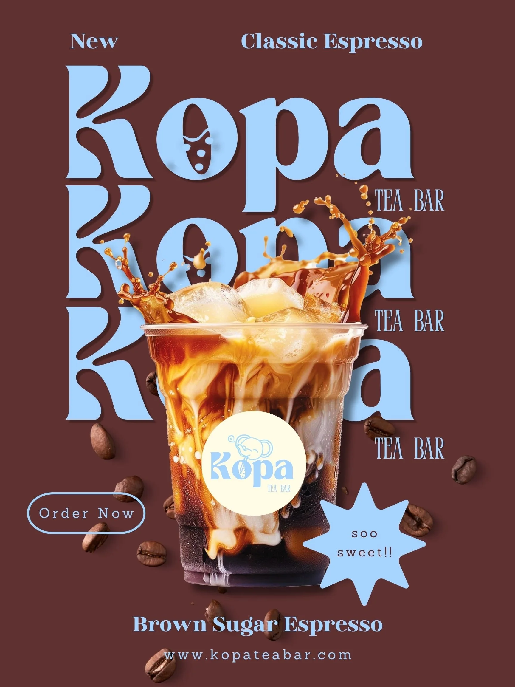
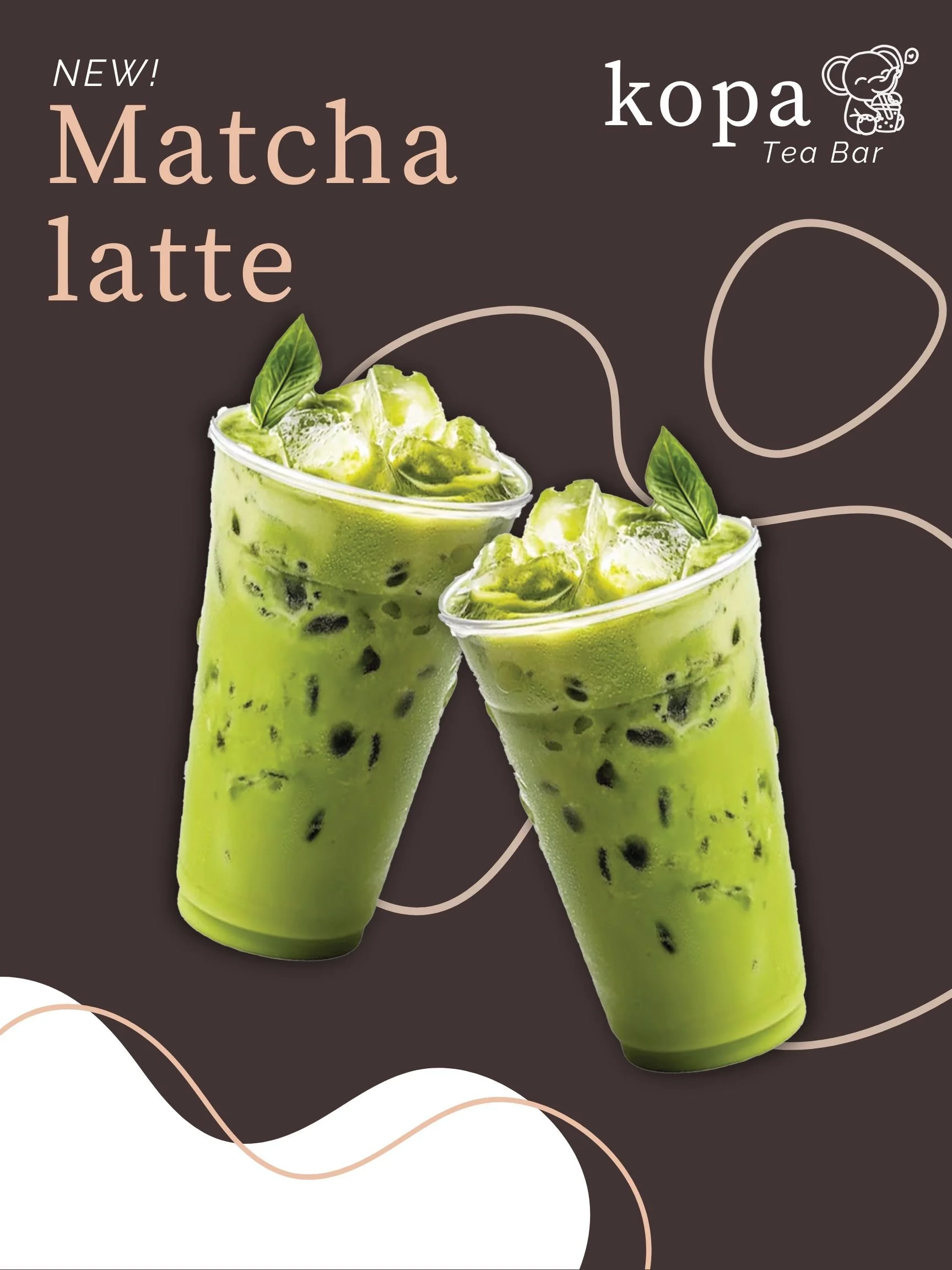
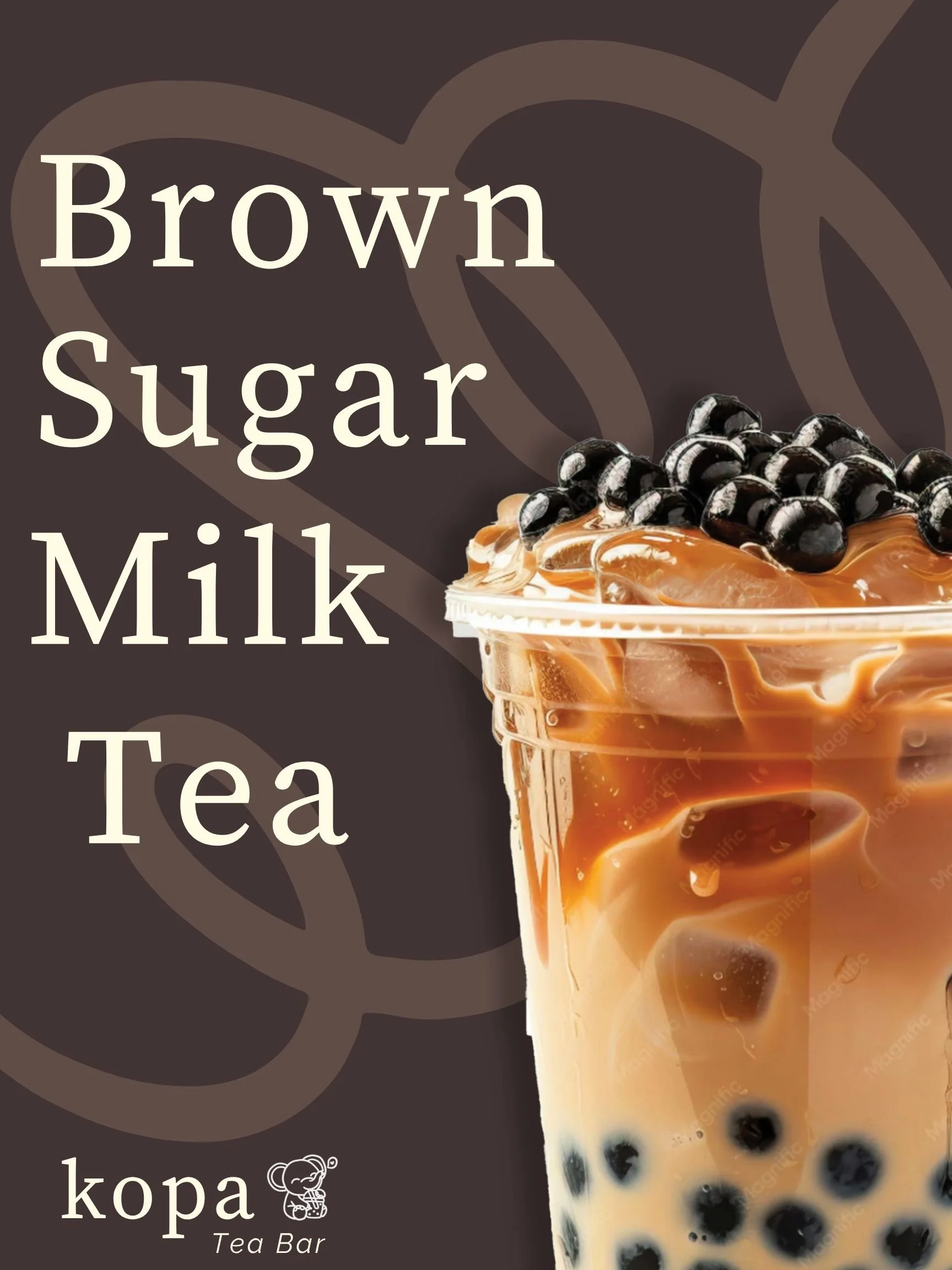
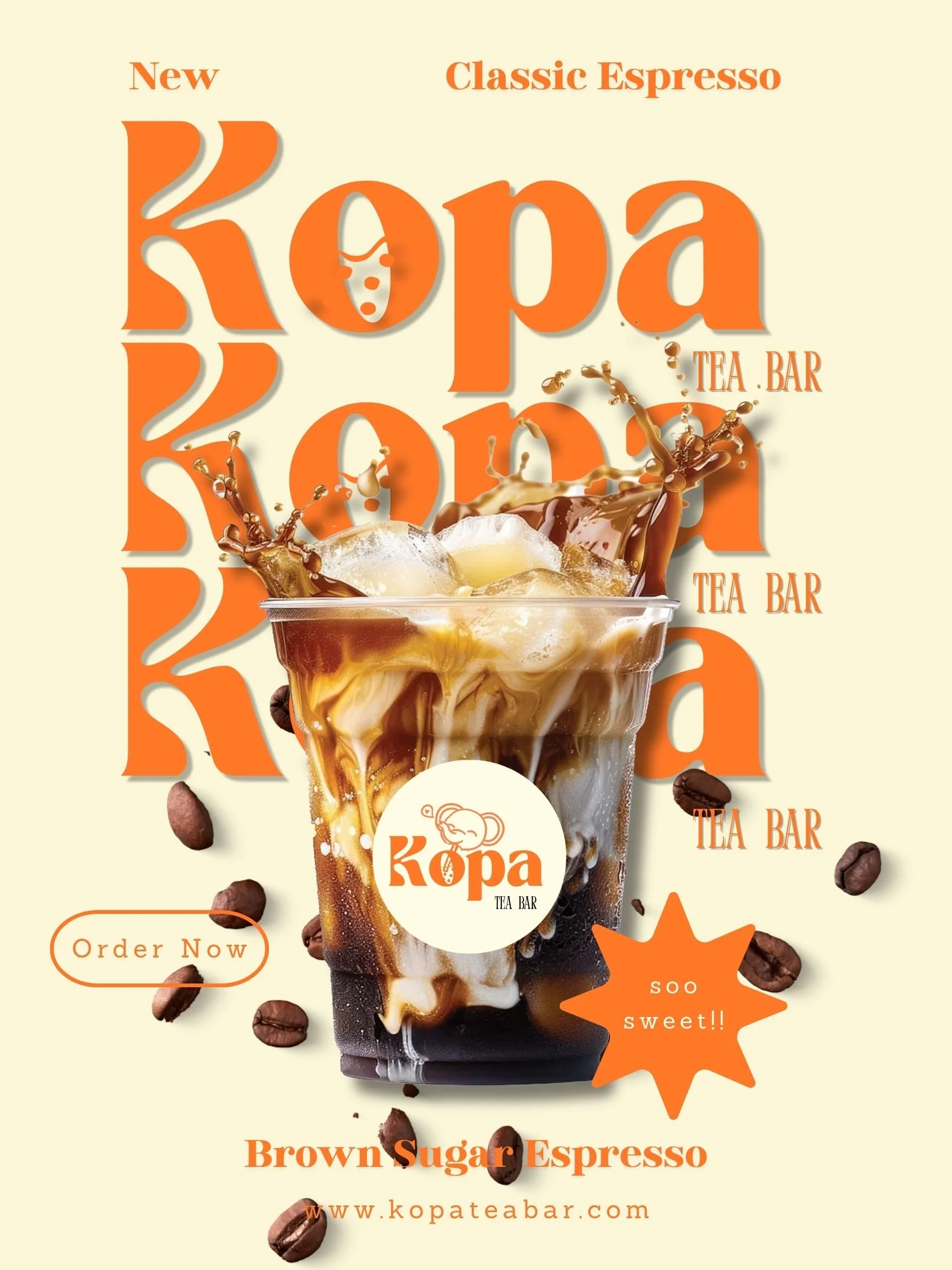
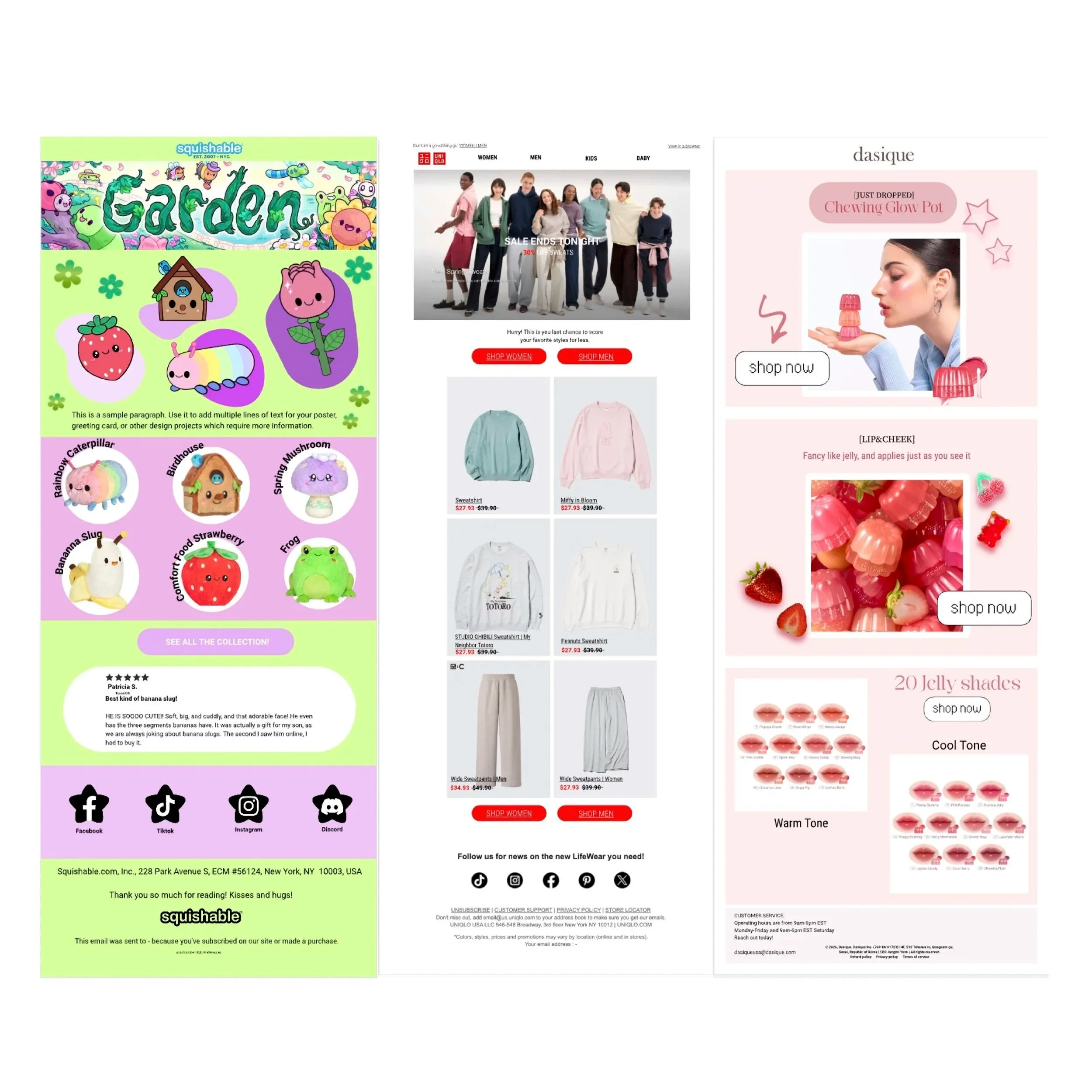
I wanted to create some mock up emails for already existing brands to showcase my adaptability to an array of brand personalities. This is my interpretation and understanding of the brands and the elements each has created.
Squishable:
The visual branding of squishable tends to lean more playful and cozy, built around a strong sense of softness and a quirky personality. The characters of the plushies feel friendly and and emotionally readable, this is translated in their visual branding across their website and social media. Color palette tends to be rich in color with gentle pastels with occasional bold accents, this gives it a contrast between cute and weird which I believe is part of the brand's charm.
Uniqlo:
The visual branding of Uniqlo is minimalistic and highly structured, clean layouts and consistent typography with very little “visual clutter”. Their branding is easily digestible, built to feel modern, functional , and globally accessible. Their branding is instantly recognizable with that signature with the use of red and white, creating a confidence in their branding. The typography is clear and user friendly using sans-serif font. As far as graphics, Uniqlo keeps the focus on the clothing rather than having visuals to compete with. The goal is clarity over mood or fantasy. Their clothing designs are practical everyday wear, durable and timeless. This perfectly translates into their design choices .
Dasique:
The visual branding of Dasique is soft, romantic, and curated around a dreamy feminine interpretation of everyday beauty. The color palette is full of soft pastels, heavy on the use of pink, peach, rose, and beige tones. The colors feel airy and sweet rather than bold or high contrast. The layouts are clean and clear following the standard ecommerce UI. The brand uses small accent details for the graphics to further tell the story of this feminine and delicate makeup brand. Using visuals like desserts and fruits to add some fun into a more elegant style. The typography is thin and defined, not overpowering, supporting the visuals rather than competing with them, reinforcing the quiet elegant tone. The brand sits between playful and mature
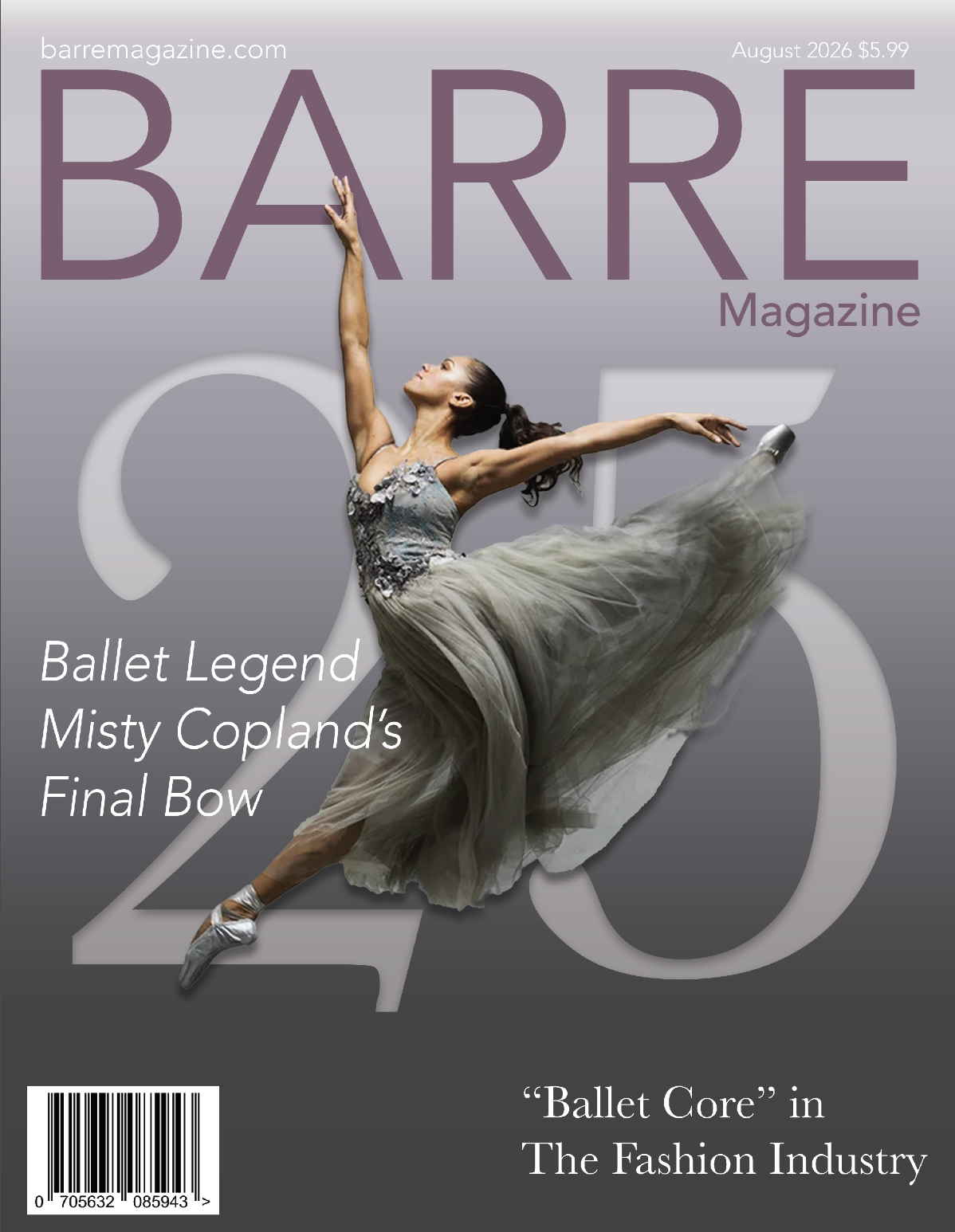
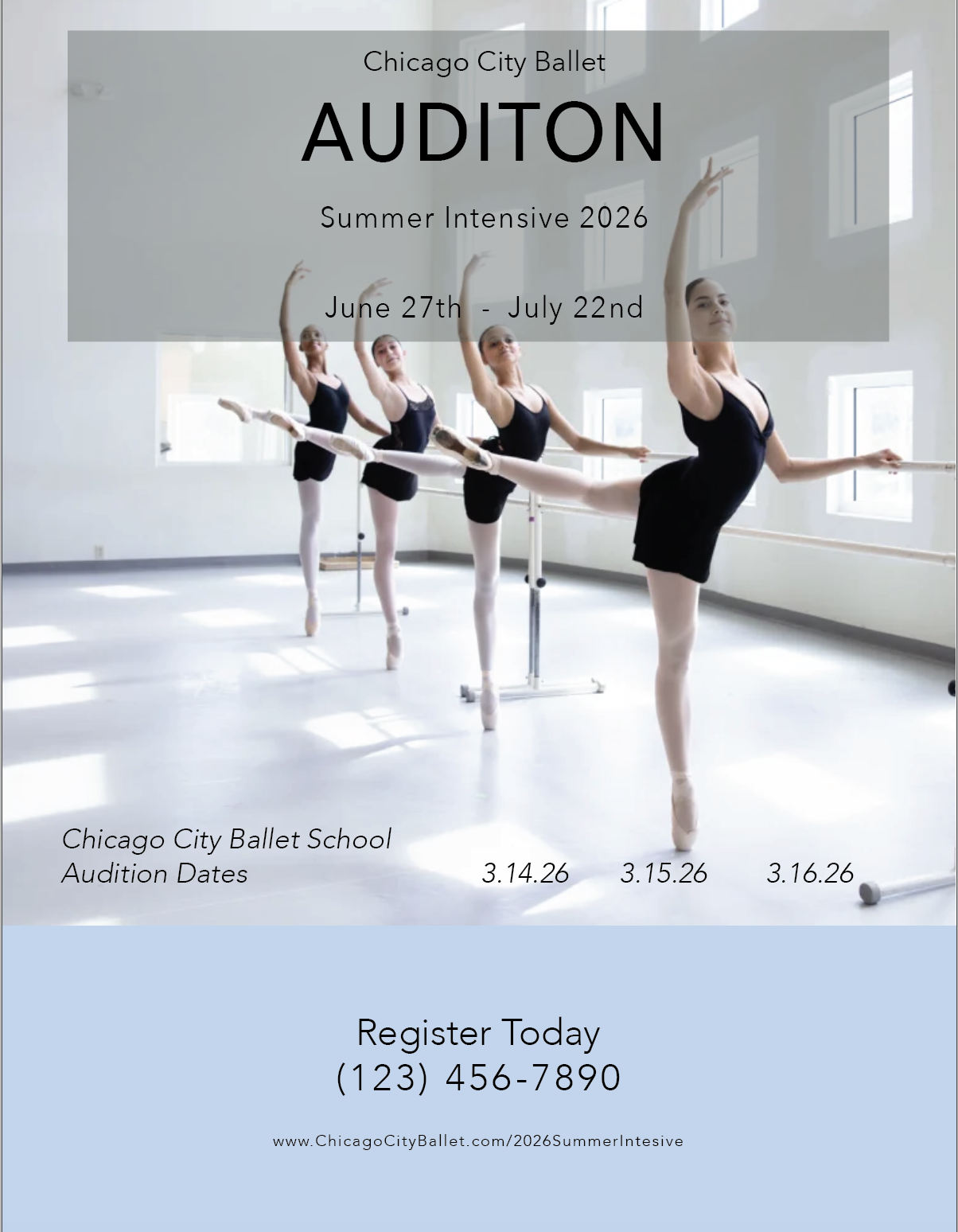
I love layout and working with Indesign, one of my favorite projects to work on are magazines. I love magazine layout, thinking about how you can take a written piece and create graphics and photos for it is something I really enjoy. I would love to create my own magazine one day so I thought I would start practicing with a mock up. I thought about a world and topic that I am very familiar with that can create good content for. I have danced my whole life and have been heavily influenced by the ballet world. I knew that a ballet magazine would be a perfect topic! I am inspired by magazines that I used to read all the time as a young dancer like, Dance Magazine, Dance Spirit Magazine , and Pointe Magazine just to name a few. Presented here I have a front cover, two spreads, two single pages and a back cover.
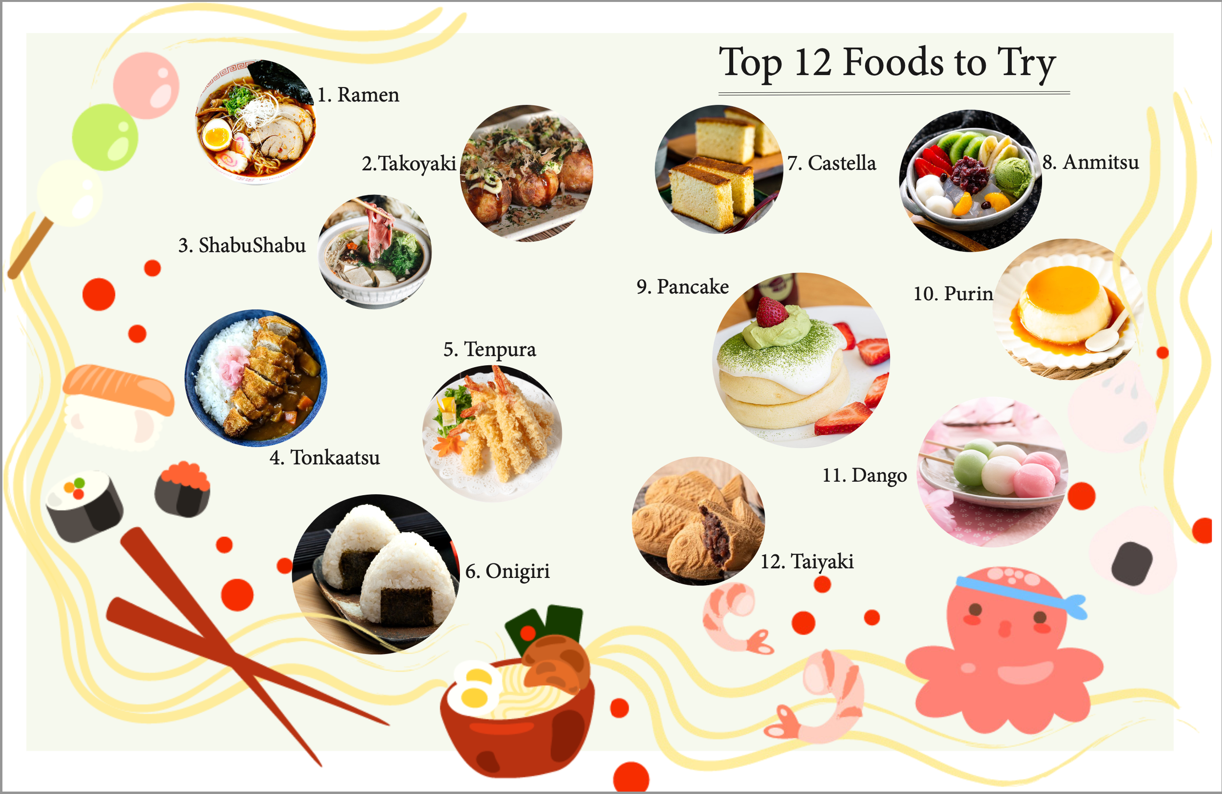
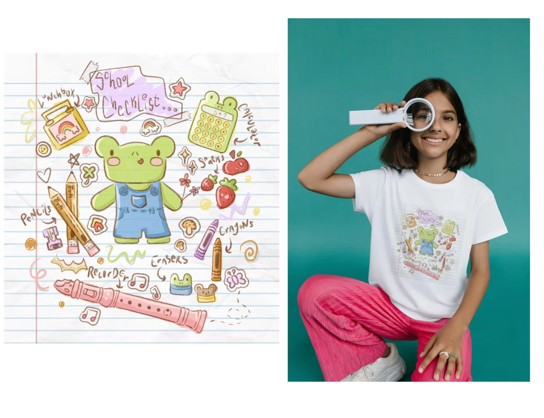
SCHOOL CHECKLIST:
Back to School never looked so cute! All the class essentials that goes into Frogys backpack! The style is very colorful and mimics a drawing on a spiral notebook page.
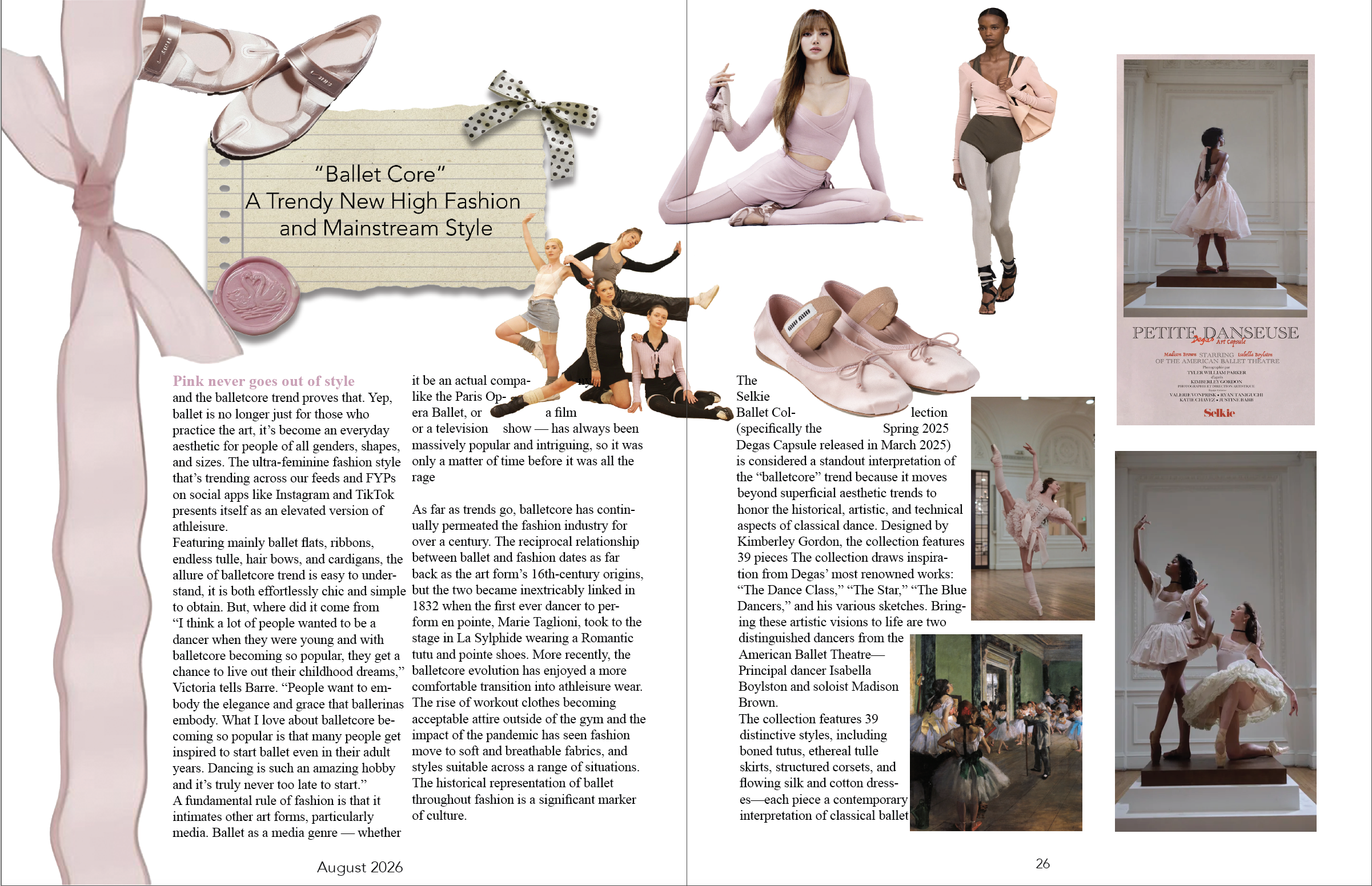
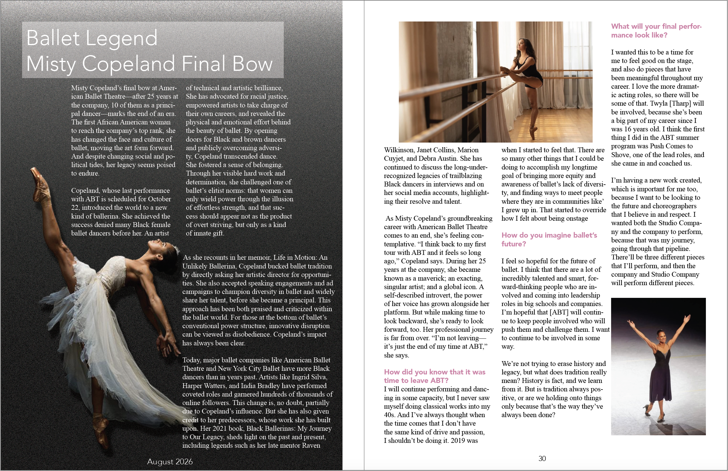
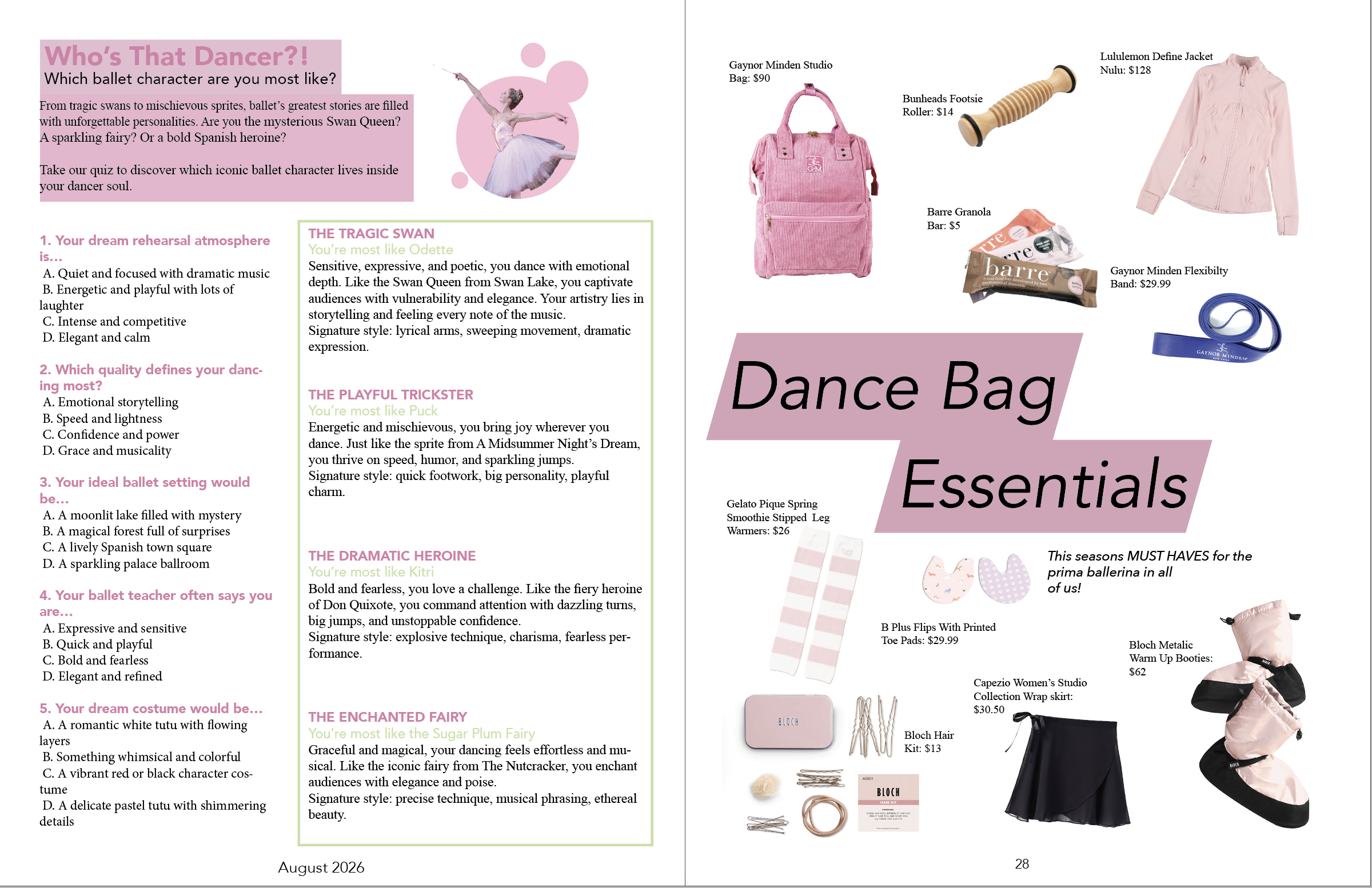
For the branding I wanted it to feel like a modern lifestyle magazine that elevates ballet into a fashion forward, aspirational identity. I wanted my target audience to not just be for the professionals but for the ballet students who aspire to be prima ballerinas. For those that live in the ballet world and where we can all go to connect with one another as we do on social media. For the style I wanted to draw inspiration from my favorite dance magazines as I mentioned previous. Love the clean and elegant style of “Dance Magazines” front cover layouts that very much focus on the center image. I like there to be emphasis on movement and grace in the photography to help represent us dancers. For the layouts it was important that it was kept clean and not too crazy as to compete with the text. Color palette is more muted, feminine, and elevated. Having dusty mauve, blush pink, soft grey and creams dominating with the occasional black/charcoal for contrast. This creates a romantic and elegant tone for the magazine which aligns with ballet’s traditional softness. Typography is very minimal using sans-serif, was important to me that the font made the magazine feel more like a high fashion magazine like a vogue layout. I wanted this to feel like a student would read it but also I think that adding that fashion forward vibe to it reminds the reader about how elegant the art form is, mixing art and aesthetic.
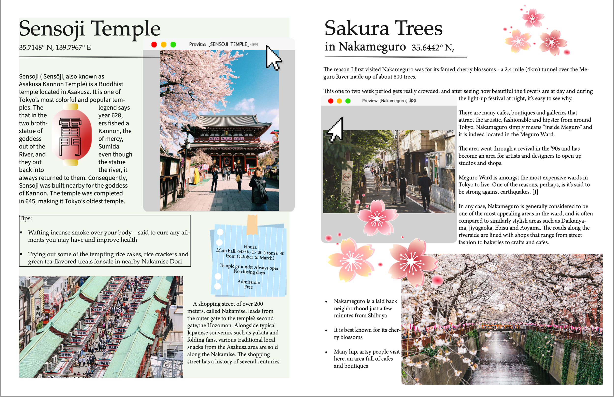
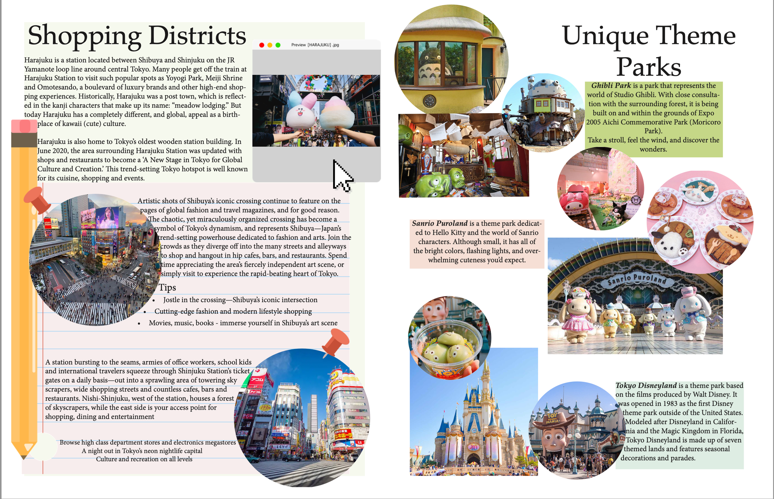
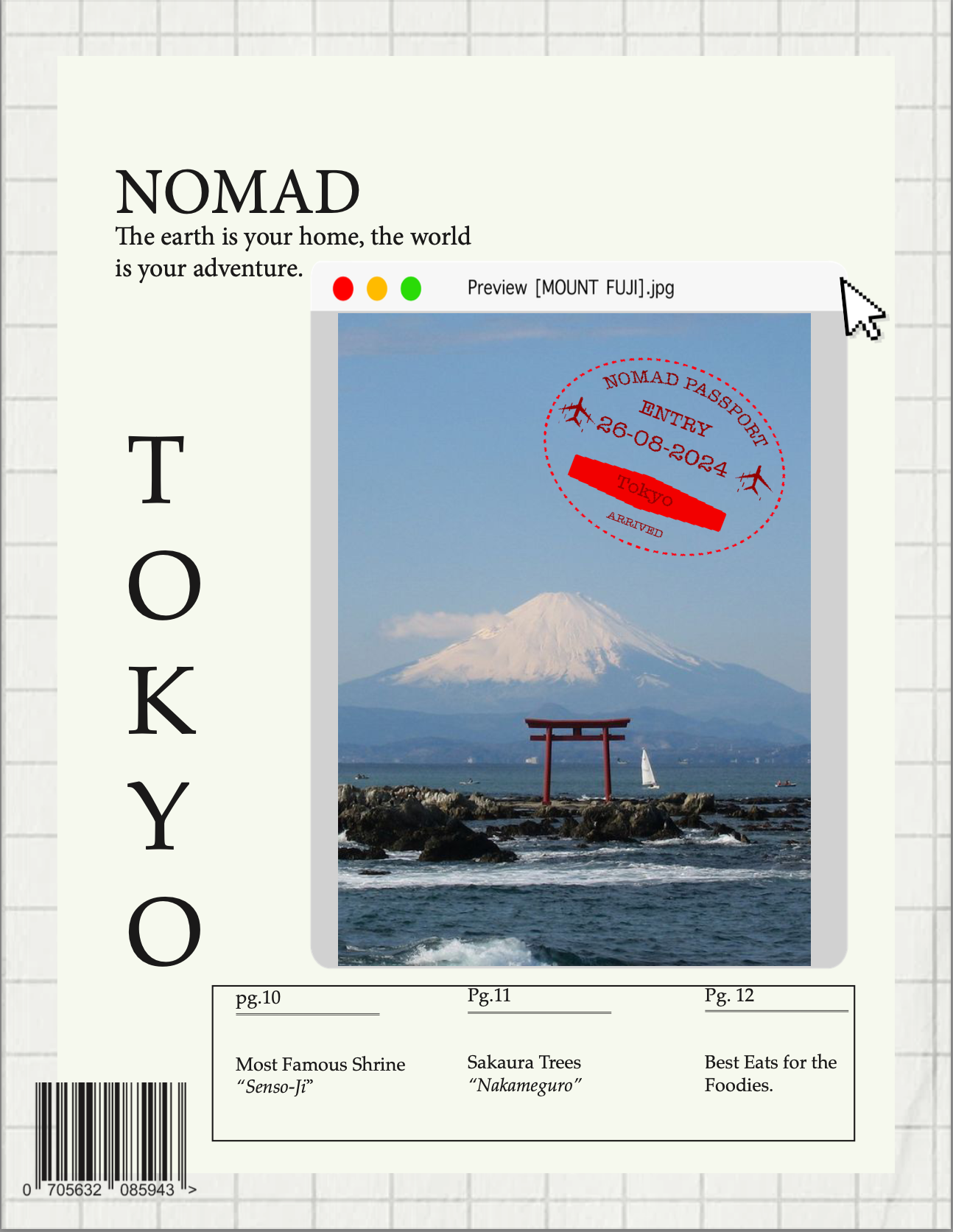
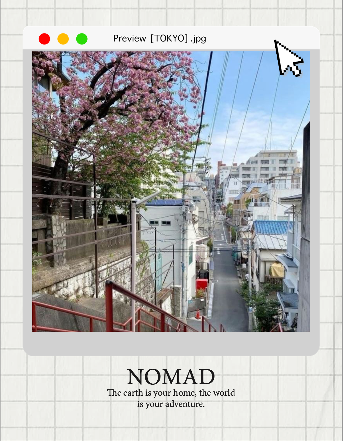
This travel magazines visual branding is fun, colorful and very interactive with the graphics helping lead the readers experience into the culture. I wanted this to feel more friendly and welcoming. My target audience being school students researching for class . This would more likely be used in a classroom setting. I wanted the graphics to be fun and mimic a desktop interface, as if you were searching for the information on the country online. I also wanted it to look like a bulletin board where there would be little post it notes with information and pinned photos like you were planning your trip. Colors are not overly saturated here, a bit more pastel in tone. Making this feel bright and engaging. The layout is fun and has more movement to it, the graphics and text are all moving together in a clean choreographic way. Photos are overlapping and there’s a sense of play. Overall the tone is fun with a sense of play but also a little touch of a Nat Geo but make it for school kids.
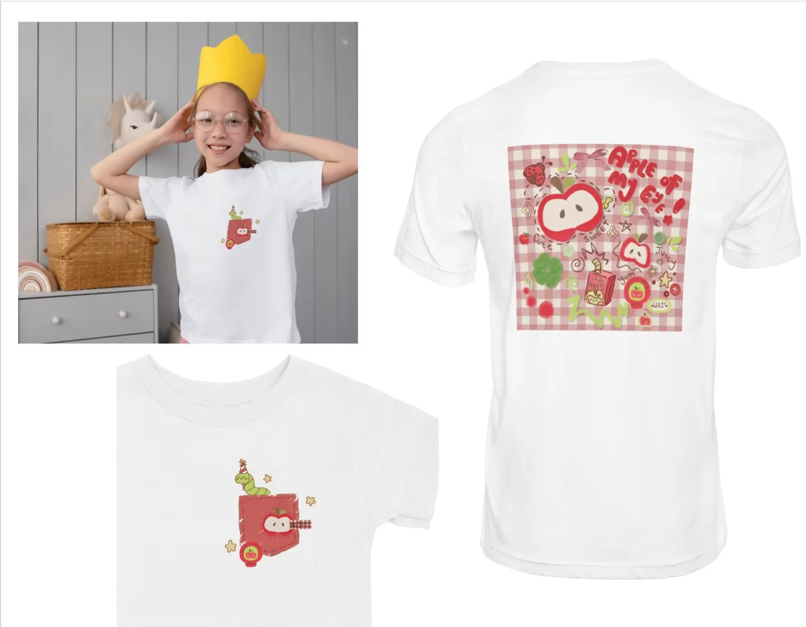
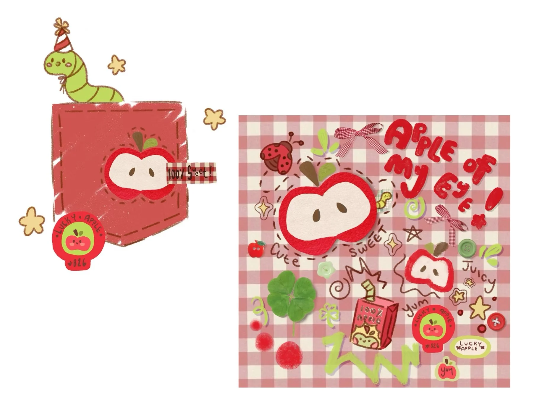
APPLE OF MY EYE:
This design is super fun! Think fun picnic in the park snacking on apples under the bright bright sun! The style is fun and playful for kids and has a collage type feel
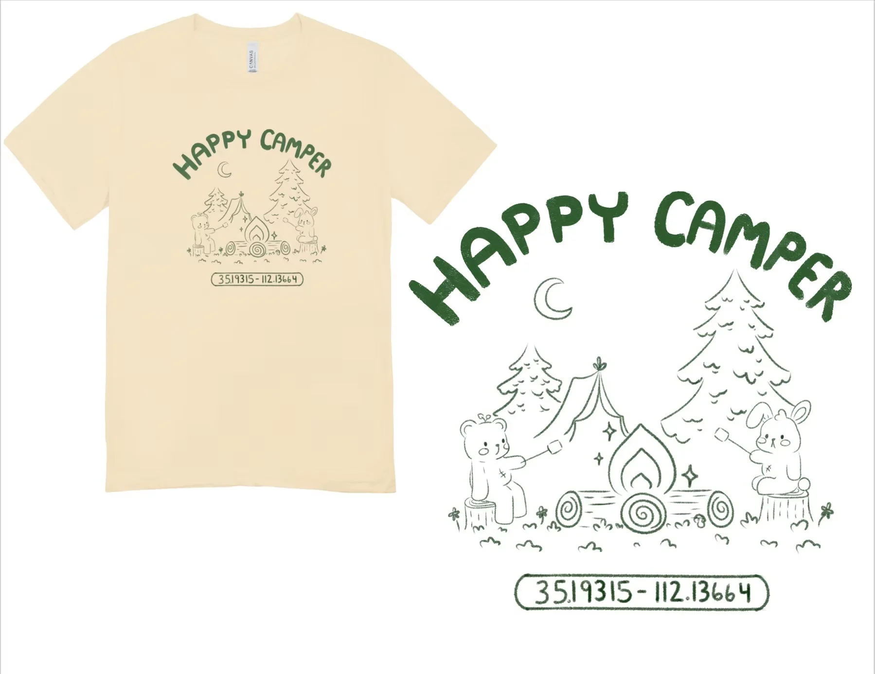
HAPPY CAMPER:
For the cutest little camper on the grounds! Bear and Bunny share a campfire together while roasting some toasty marshmallows! The design is simple with a pencil drawing line work.